HTML Images | Adding Visuals in Web Pages | Beginners Guide
Bhumika Goel / January 2024
Introduction
Images and graphics make your web page look great, communicate effectively, capture the viewer’s attention, convey information, and enhance user engagement. Apart from decorative tools, pictures speak loudly and serve as powerful tools to:
- Improve text readability: Visual graphics break the anatomy of long texts by breaking monotonous reading into appealing visuals and good experiences.
- Stimulate audience connection: The images used on a webpage can leave strong and relatable impressions on the users. Graphics allow the web audience to emotionally connect, personally associate, and empathize with your web content. They also help you build trust and credibility. Pictures leave a lasting impact on viewers and are more memorable than simple texts and paragraphs.
- Reduce Subject Complexity: The complexity of data gets reduced with the use of art and diagrams. Images help in demystifying and simplifying the information for easy understanding.
- Reinforce brand identity: Carefully selected visuals and graphics can reinforce your brand personality and message, creating a cohesive and memorable experience.
- Boost user engagement: Interactive elements like image galleries or slideshows can encourage users to explore your content and spend more time on your website.
Let’s learn how to add images to make our website look more professional and attract web users.
What are the different ways to add images to a website?
There are several ways to add images to HTML pages.
- HTML embed element <img>. Simple images can be incorporated into web documents with the help of the <img> tag. Images can be included from an internal or external resource. The image is downloaded via a URL associated with the src attribute. If the src attribute is a valid path, the browser successfully displays the image on the frontend. To show web images, the browsers must know their address; hence, the src attribute is the most important part of the img tag.
<img src="sample-image.jpg" >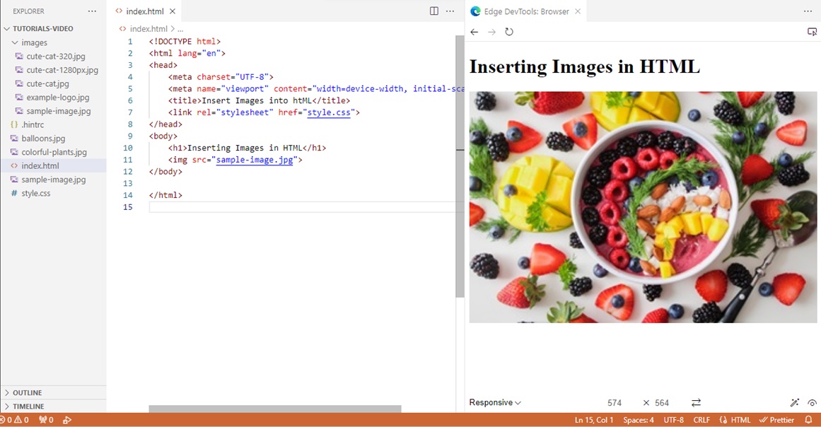
Other optional global attributes associated with the image embed element are as follows:
- title: Stores additional information that acts as a tooltip for users when hovering over the image.
- alt: specifies the alternate text for the image. It is an important factor in enhancing accessibility and usability features in terms of search engine optimization and user experience.
- width: Specifies the horizontal size of the image
- height: specifies the vertical length of the image.
- style: Defines the looks of the image
- class: represents the CSS class name responsible for the image on-screen presentation.
- loading: directs the loading instructions to the browser. (If the image should be deferred while downloading or not.)
- fetchpriority: sets the priority for downloading an image component.
- decoding: tells the browser to decode the image in synchronous or asynchronous mode.
- srcset: different sources of the same image separated by commas can be used to display the required picture.
- sizes: indicated the sizes of different sources of the image to be downloaded.
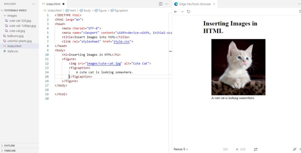
- HTML <figure> element: The <figure> is a block-level element of HTML. It is used to insert or add self-contained objects like illustrations, a diagram or code. The figure element does not break the main flow of the main content irrespective of its position. It acts as a semantic container for images. Since it is a block-level element, it is automatically allocated margins. However, you can style it with your own color theme and dimensions. It provides several advantages over simply using the <img> tag alone:
While <img> focuses on the image itself, <figure> acts as a semantic container. It groups the image with the dedicated figure caption tag <figcaption>. It helps to structure your content and improve accessibility for screen readers and assistive technologies.
Example:
<figure>
        <img src="images/cute-cat.jpg" alt="Cute Cat">
        <figcaption>A cute cat is looking somewhere.</figcaption>
</figure>
- CSS Background Property. Cascading stylesheets define the layout of websites. These files are responsible for the colors, fonts, display, and website structure. With the help of CSS, you can embed one or more images in the background to make your web documents look more lively and happening. The CSS property needed to achieve our goal of attaching a picture is background-image. You can embed different numbers of images using the background-image property. To add more than one image, simply add a different image address inside the url function, separated by a comma.
background-image:url('sample-img.jpg'), url('sample-image.jpg')
How to add images for different screen resolutions?
The internet world has shifted from larger screens to mobiles in recent years. It is essential for website owners to ensure the images are optimized well for different devices like mobiles, monitors, laptops, etc. Web designers and developers can ensure optimum user experience results by utilizing HTML elements and CSS media queries.
- HTML <picture></picture> Element: The <picture> element with the <source> tag specifies different image versions for distinct screen resolutions. It enhances the responsiveness of the image according to the mobile, laptop, or device you use to view the webpage. It is an inline-level element and does not start with a new line. It helps in making images responsive by providing features like multiple source options and media query integration. Instead of simply defining a single image source, <picture> allows you to specify multiple image sources (using <source> elements) with different sizes or formats, leveraging browser capabilities to choose the most suitable option for the user’s device and screen size. The picture tag ensures optimal image delivery for various screens and resolutions, improving performance and reducing unnecessary data transfer. You can integrate media queries within <picture> tags, further refining image selection based on specific screen sizes or device types. It provides granular control over image delivery, leading to a more tailored and optimized viewing experience across devices.
Example
<picture>
       <source media="(min-width: 850px)" srcset="images/cute-cat-1280px.jpg">
       <source media="(min-width: 650px)" srcset="images/cute-cat-320.jpg">
       <source media="(min-width:400px )" srcset="balloons.jpg">
       <img src="colorful-plants.jpg" alt="Example Image" >

</picture>
Below is a working demo of the HTML picture element.
- CSS Media Queries: You can apply different styles to the same web page for different device types using CSS media queries. Utilizing media queries, you can deliver an optimum web experience to your visitors by adhering to the features and characteristics of the device type they are using.
@media print {
  /* css ..... */
}
@media (min-width: 380px) and (max-width: 500px) {
  /* css ....*/
}
What types of images can be added to an HTML document?
The HTML <img> tag is the gateway for incorporating images into your web pages. Let’s explore the different image formats you can work with:
- JPEG (Joint Photographic Experts Group): Ideal for photographs and complex images with many colors due to its efficient compression capabilities. However, compression can lead to some loss of quality.
- PNG (Portable Network Graphics): supports lossless compression, making it perfect for graphics with sharp edges, text, and logos. However, file sizes can be larger than JPEGs.
- GIF (Graphics Interchange Format): Primarily used for animations and images with limited color palettes.
- SVG (Scalable Vector Graphics): employs vector graphics, making them infinitely scalable without losing quality. Ideal for logos, icons, and illustrations.
- WebP: A relatively new format offering superior compression compared to JPEG while maintaining quality, making it a popular choice for modern websites.
Let us compare the main features of figure and picture elements of HTML
| Feature | Figure | Picture |
|---|---|---|
| HTML Element Level | Block Level | Inline Element |
| Tag | <figure> …… </figure> | <picture> …….. </picture> |
| Core Purpose | Add context and semantic meaning to the inner elements. | Enhance responsive delivery of images |
| Functionality | Group inner element with caption | Embeds multiple images for different screen resolutions |
| Accessibility Benefit | It helps the audience understand the content | Ensure correct image delivery for mobiles and other devices. |
| Performance Benefit | None | Improves loading and reduces data transfer |
| Content Structure | Creates semantic structure for content | None |
| Captions | Figcation is required to provide a meaningful context to the image embedded in <img> element. | Not generated |
| Requirements | <figcation> as first or last child of the block level. | <img> as last child to provide fallback image. |
Top Image Sources
Many online resources provide royalty-free images. Some of them are:
- Unsplash: One of the best collections of high-resolution photos under the Creative Commons Zero license. It allows images for free use without attribution.
- Pexels: Huge collection of royalty-free high-quality photos and vectors.
- Pixabay: Boasts a diverse library of images, videos, and illustrations, all free for personal and commercial use.
- Stocksnap: Curates a collection of beautiful royalty-free photos contributed by talented photographers.
- Burst by Shopify: Provides a curated selection of high-quality product photos ideal for e-commerce websites.
Conclusion:
- Images enhance the website design, trust, and credibility.
- Using alternate and title attributes enhances accessibility and search engine optimization efforts.
- The responsiveness of the image gets modified with the use of picture tags.
- The figure tags provide semantic meaning to graphics and photos used in HTML documents.
- <picture> and <figure> tags support standard HTML attributes like class and id, allowing further customization and styling.
- Remember to provide relevant and meaningful alternative text (alt) for both the <img> and <figure> elements for optimal accessibility.
 Bhumika Goel is a technology and design thinker, a lifelong learner having a wide range of experience across WordPress development, content marketing and search engine optimization. Creative web applications, tools, and products that your customers will love and get you real business results, is something she can empower you with. She is passionate for delivering high-quality work that meets the needs and expectations of her clients. She is always eager to learn new skills and technologies to enhance her portfolio and stay ahead of the curve. She is looking for new opportunities to collaborate with other professionals and help businesses grow their online presence and reach their goals.